One of the largest changes and advancements on the Internet happened on April 21st, 2015. This change was lead by Google and was known as “Mobilegeddon.” This algorithm update strongly recommended to website owners to ensure that their websites were mobile-friendly. Otherwise, websites who did not have a mobile-friendly site would result in their pages be penalized and decrease in mobile search result rankings. Those that are not up to date on the latest technology and development news are likely to be left behind. However, here at Bullseye Marketing Consultants, our custom web designers have provided the necessary tips and information in order for you to create a mobile-friendly website.
The new paradigm in regards to web development, and any online applications is the concept of “mobile first”. Before 2014, custom web designers use to think about the features and type of website such as Flash, and type of Menus. The device that is used most often to connect to the Web today is now mobile devices. That includes mobile phones, tablets such as the iPhone, iPad, notepads, even Kindles. Now, custom web designers first thought when providing custom web development and solutions is to think mobile first.
[toc]
[wpu_silo links=’10’]
Whether custom web designers are creating web design for West Palm Beach clients, providing affordable SEO service, web design for small businesses or corporate enterprises, custom web designers today need to provide not only mobile web design solutions but also need to provide consultative services in order to explain and educate their clients on this new mobile-friendly frontier. Mobile web developments require much different functionality and have added a layer of complexity in the web development process. Custom web designers need to think not only about cross-browser functionality, but also, need to plan for cross-platform functionality. For example, a website can display different on a Chrome Browser differently than on a Firefox browser and can function and display differently on the iPad vs. the Samsung Galaxy phone or tablet PC.
Below are various tips from custom web designers on how to develop a better mobile-friendly website.
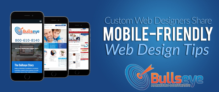
Custom Web Designers Share Mobile-Friendly Web Design Tips
Custom Web Designers Tips
1. Separate Mobile-Friendly Websites Are A No-Go
When mobile sites were getting started, custom web designers would create a totally separate site for their mobile version. Certain content would be selected; a sub-domain or sub-directory would be created in order to create a totally separate site.
Implementing a separate mobile site solution is not a good idea given the duplicate content issue. Google will penalize your site for duplicate content. Additionally, it would be difficult to rank 2 pages URL’s that have the same name.
For local providers such as Bullseye Marketing Consultants, a web design West Palm Beach development agency, not only can they provide the knowledge of mobile-friendly websites, but also, develop high-end custom website designs. Additionally, clients can receive affordable SEO services. Getting a responsive website design will ensure that your customers can access your content whether it be a real estate website, legal firm, ecommerce website design or membership website design. The custom web designers at www.bullseyemarketingconsultants.com will deliver a tested mobile-friendly website that will not get you penalized.
[message type=”custom” width=”100%” start_color=”#FFFCB5″ end_color=”#F4CBCB” border=”#BBBBBB” color=”#333333″]
2. Responsive Web Design
The concept of responsive web design provides web developers methods to develop and configure a website so that it will display across multiple platforms and various device sizes. Responsive design enables the development process to be more efficient.
Responsive web development uses features such as media queries which the primary factor is allowing for sites to be adjusted and viewed across many device sizes. Combined this feature with flexible web layouts, customized mobile-friendly cascading style sheets and the use of images that can be automatically resized for a certain device. For example, the WordPress platform as well as some WordPress themes automatically creates multiple sizes of the images for responsiveness when the images are uploaded to media library. This saves an enormous amount of time, rather than have to manually re-size and code custom images for various device layouts.
[/message]
3. Content Resizing & Scaling
It’s important to implement a viewport Meta Tag. Content is sized and scaled on devices using the virtual area called a viewport. This viewport is used by a browser’s rendering utility engine to display content on the various devices. This feature is essential to the mobile viewing functionality in browsers. The viewport meta tag is the code that executes information to the browser in order for the browser to correctly fit the content to the certain size of display.
4. Buttons and Fonts
As in any website development, created by custom web designers, the size of call-to-action buttons as well as size and use of fonts is very important. It’s even more important when it comes to how it’s displayed across mobile devices. The goal is to make it simple for your readers to read the content on their mobile devices without forcing them to zoom in. The recommended font size on devices should be 14px. Font size can be reduced to 12px when text is on a menu item or contact forms.
In regards to call-to-action buttons, it’s best to not have them too small, where it will be difficult for the users to touch or swipe on their device. User friendly is also mobile-friendly. According to Apple’s guidelines, the recommended button size is 44px by 44px. These guidelines are meant to improve conversions, whether it’s an ecommerce site, or lead management site.
5. HD Quality Images
Quality web developments and responsive websites are best served with high-resolution images. Not only will it provide a better user experience, but also, ensure that the browsing experience is not grainy or have a blurry or pixilated look.
6. Zoom Features
It’s not recommended to enable the auto-zoom feature on mobile devices. It’s best to ensure that media queries perform its functions in order to automatically resize the content, images according to the device type that has accessed the content. Remove the default zoom feature to ensure you have a quality user experience and improve the mobile-friendly development process.
7. 3rd Party Video Apps
If your website is video heavy, then custom web designers recommend that you use 3rd party social media tools such as YouTube or Vimeo to host your videos, rather than host them directly on your site. Not only this will save you bandwidth if your site is getting heavy traffic, but also, YouTube and other video platforms is now built to be mobile friendly and responsive. Additionally, embedding videos from those platforms is easier.
Get access to custom web designers and affordable SEO service provided by website development West Palm Beach development agency Bullseye Marketing Consultants. You can learn more about these guidelines and tips to ensure you improve your mobile-friendly web development process. The biggest internet marketing trend of 2015 is mobile development and design. Ensure you are ahead of the curve and set your business up for success with these custom web designers tips.